

About Me
Hey! I'm Jasmine, an 18-year-old junior graphic design student with a passion for visual storytelling and a creative mind for crafting clean, impactful designs. I’ve studied graphic design at college for the past two years, which has helped me build a strong foundation in design thinking, creative problem-solving, and visual communication.
My key strengths lie in branding and identity design, illustration, and packaging. I enjoy bringing ideas to life through visuals that are clear, engaging, and thoughtful. I believe design is not only about aesthetics, but also communicating ideas effectivly and understanding client's needs and desires.

Content

1
2
![berry me [Recovered]-06.jpg](https://static.wixstatic.com/media/089832_01ec762b4c414419872c87a337760ed0~mv2.jpg/v1/crop/x_0,y_84,w_5846,h_8666/fill/w_313,h_464,al_c,q_80,usm_0.66_1.00_0.01,enc_avif,quality_auto/berry%20me%20%5BRecovered%5D-06.jpg)
3

4

5

Bodyshop Branding

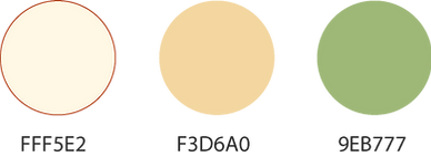
Logo Colour Options
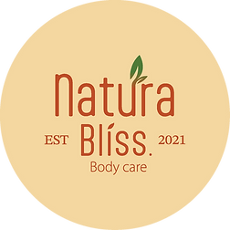

About Brand
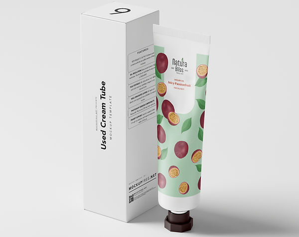
Natura Bliss is a conceptual eco-friendly body care brand created for a personal design project. At Natura Bliss, we believe self-care should be a daily ritual—one that’s kind to your skin, your wellbeing, and the planet. We're an eco-friendly body care brand that combines natural ingredients with a touch of affordable luxury, created especially for older teens, adults, and women who seek gentle yet effective care.


I designed packaging for apple, lychee, and passionfruit-scented shower gel, body butter, and hand cream.


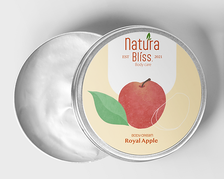
All illustrations were hand-drawn by me in Procreate. To reflect the eco-friendly concept of this body care brand, I used low-saturated colours and added natural textures using texture brushes.


I used the same illustrations and the white stadium shape with the logo across all the packaging designs to create a cohesive and connected look. This ties the products together visually while also reinforcing brand recognition and enhancing shelf appeal.


Asia food restaurant Branding

The Brand and Logo
Home of Oriental is a conceptual Asian street food restaurant brand, created for a personal design project. To clearly communicate its connection to Asian cuisine, I incorporated culturally inspired elements into the logo design. These include a pair of chopsticks and traditional Chinese decorative cloud patterns known as Xiang Yun, which symbolise good fortune and harmony.

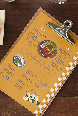
Menu Design Developments


Final Design

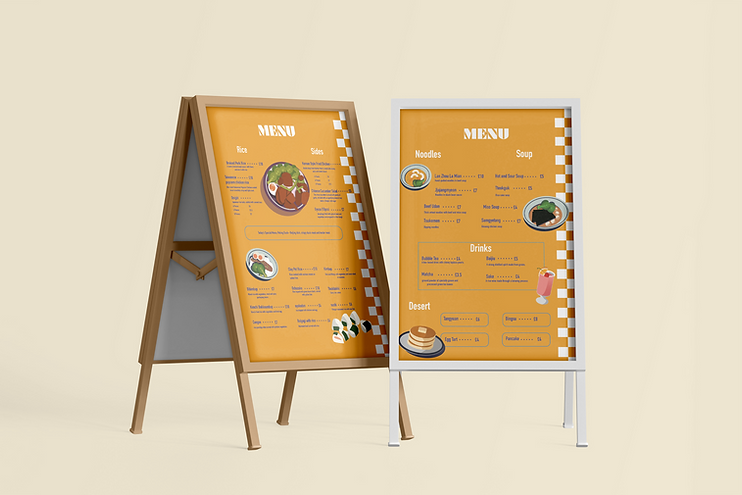


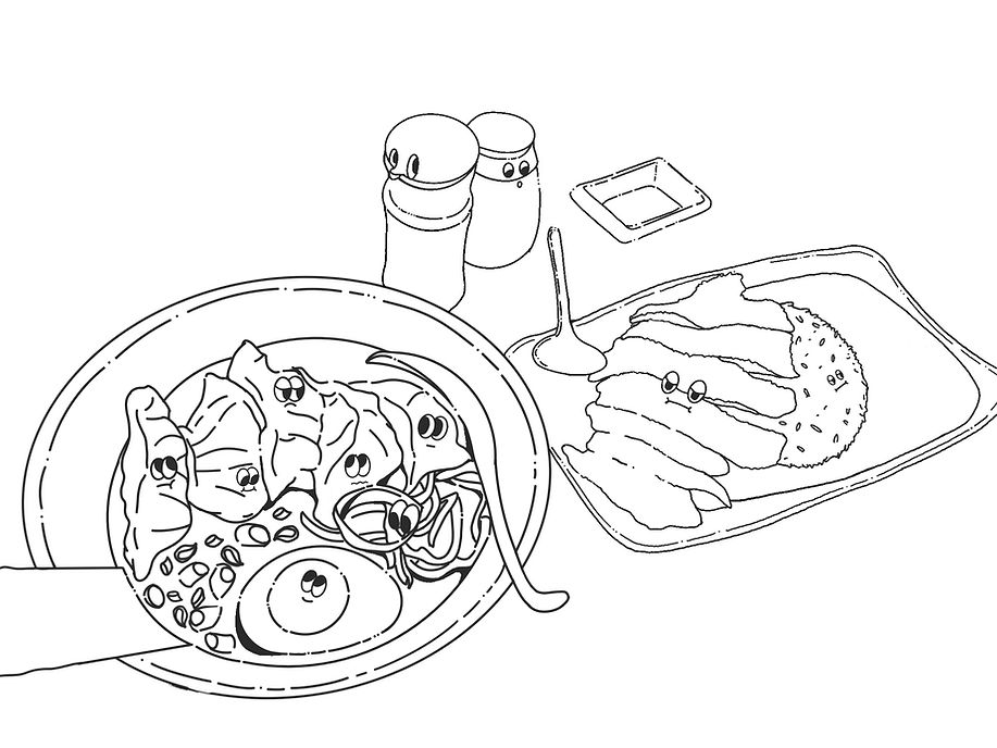
For this project, I created a series of custom illustrations in Adobe Illustrator, which are featured widely across the restaurant’s menu and packaging design. Inspired by the vibrant atmosphere of Asian street food culture, I incorporated bold, street-style elements such as checkered patterns and a dynamic color palette.
Package Design


T-Shirt Design
![berry me [Recovered]-06.jpg](https://static.wixstatic.com/media/089832_c1b6dc618c9642a7a1fab00276174408~mv2.jpg/v1/crop/x_0,y_916,w_5846,h_6867/fill/w_656,h_771,al_c,q_85,usm_0.66_1.00_0.01,enc_avif,quality_auto/berry%20me%20%5BRecovered%5D-06.jpg)
![berry me [Recovered]-03.jpg](https://static.wixstatic.com/media/089832_81f7dafe4ef340469b553826c0daece7~mv2.jpg/v1/fill/w_375,h_246,al_c,q_80,usm_0.66_1.00_0.01,enc_avif,quality_auto/berry%20me%20%5BRecovered%5D-03.jpg)
![berry me [Recovered]-02.jpg](https://static.wixstatic.com/media/089832_5ae196dcbd2a498a93589ff554e7adb6~mv2.jpg/v1/fill/w_375,h_246,al_c,q_80,usm_0.66_1.00_0.01,enc_avif,quality_auto/berry%20me%20%5BRecovered%5D-02.jpg)
![berry me [Recovered]-01.jpg](https://static.wixstatic.com/media/089832_d4ce9a3987184bec9890341c3d06348a~mv2.jpg/v1/fill/w_375,h_246,al_c,q_80,usm_0.66_1.00_0.01,enc_avif,quality_auto/berry%20me%20%5BRecovered%5D-01.jpg)
This is a graphic tee design inspired by Y2K fashion trends. I designed a cropped t-shirt featuring blueberries and a ring to create a dreamy, nostalgic mood.

Food illustration

Inspired by Lauren Martin’s playful aesthetic, this illustration uses bold colors and expressive figures to capture emotion and personality.
Flower illustration


Woodcut style illustration with 2 options of colour